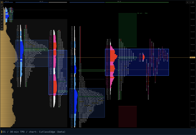
How to read a TPO chart, letter by letter
The first time you see a TPO chart it looks like a spreadsheet had a nervous breakdown. Letters everywhere, stacked in lumpy piles, nothing that resembles the candlesticks you’re used to.
Give it a week of honest attention and the letters become the most literal chart you own. Like Neo looking at the code in the Matrix. Nothing on it is derived, smoothed, or averaged. It is a written record of the session’s auction: which prices attracted business, which got rejected, and in what order it happened.
This guide covers the mechanics of reading one. If you want the bigger picture of what market profile is and where it came from, start with the pillar guide and keep the glossary open in another tab.
The mechanics: letters, periods, and prices
TPO stands for Time Price Opportunity. The recipe is simple.
Cut the regular session into 30-minute periods. Give each period a letter: the 9:30 to 10:00 ET period is A, 10:00 to 10:30 is B, and so on through the close. (Letter conventions vary by platform; some start the overnight with different cases. What matters is that each half hour has its own letter.)
During each period, every price the market touches gets that period’s letter printed beside it, once. Price can cross a level fifteen times in the B period and it still earns exactly one B.
That single rule builds everything. A price with eight different letters next to it held the market’s attention for eight separate half-hour periods. A price with one letter was visited once and abandoned.
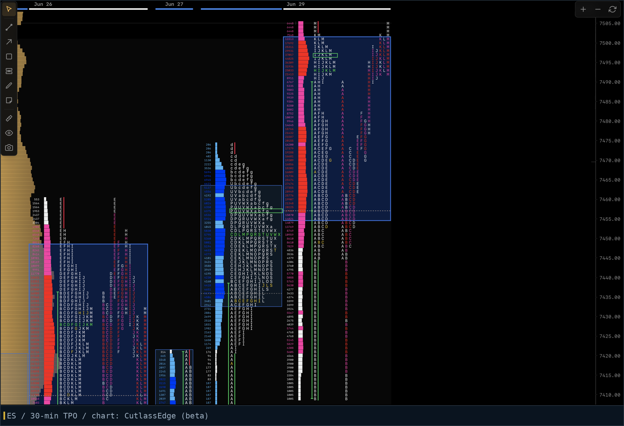
Split view and merged view
Most software shows TPOs two ways, and you want both.
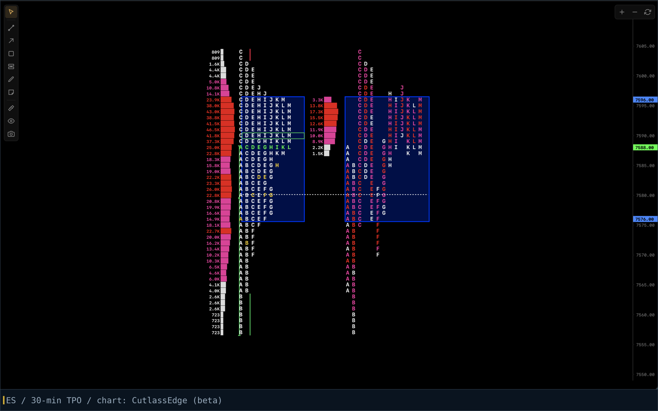
Split (or expanded) view keeps each period in its own column, left to right across the day. This is the chronological story: you can see the A period range, then where B went relative to it, then C. It reads like a timeline.
Merged (or collapsed) view slides all the letters left against the price axis, building the profile shape. This is the distribution: the sideways bell that shows where the day’s business concentrated.
The split view answers “what happened, in order.” The merged view answers “what does the market think this thing is worth.” Reading a session means going back and forth between the two.
Reading the shape
Once merged, the shape does most of the talking. A few recurring silhouettes and what they usually mean:
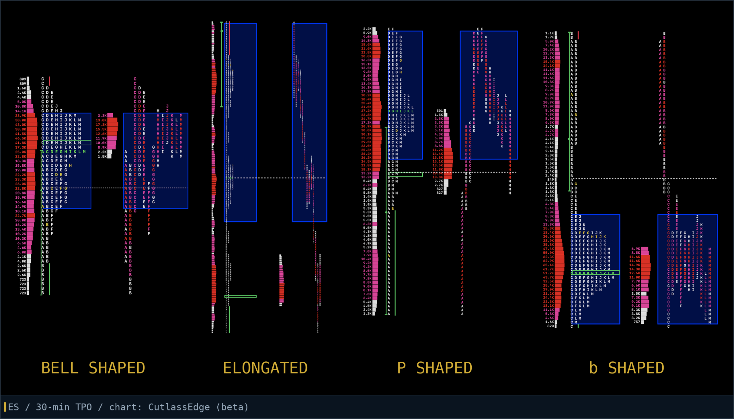
The bell shaped curve. Fat middle, thin ends. A balanced day: the market found a fair area, rotated around it, and both extremes got rejected. Expect responsive trade, value building quietly.
The elongated profile. Tall and thin, letters strung out vertically with no fat area. A trend day: price kept advertising in one direction and kept finding new business. The worst days of my career came from fading these.
The P and the b. A profile shaped like a capital P is a rally that stalled: business concentrated up top after a sharp move up, often short covering. The lowercase b is its mirror, common in long liquidation. Neither is a signal by itself; both tell you which side just ran out of urgency.
The double distribution. Two fat areas with a thin neck of single prints between them. The market did business at one level, repriced violently, then did business at another. The neck between them is a reference the market often revisits. Full treatment in Market profile day types.
The parts of the chart worth naming
A few structures you should be able to point at on any session. Each has a fuller entry in the glossary:
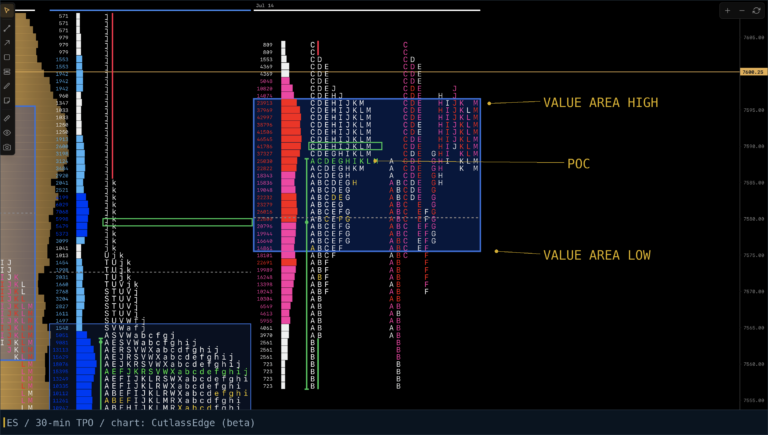
The point of control (POC): the price with the most letters, closest to the center of the range. We call this the session’s fairest price to do business. Watch the developing POC through the day; when it migrates, the market’s idea of a fair price is moving.
The value area: where roughly the middle 68 to 70 percent of the letters sit. Covered properly in Value area explained.
Tails: thin stretches of single letters at the extremes, left by fast rejection. On ES I want at least two letters to call it real excess.
Single prints inside the range: emotional moves that skipped prices entirely. They tend to get revisited. The related poor and weak highs and lows are covered in their own guide.
The initial balance: the A and B period range, 9:30 to 10:30 ET. The opening bracket the day either respects or breaks.
A session read, in order
Here is the sequence I actually run, not a theoretical one.
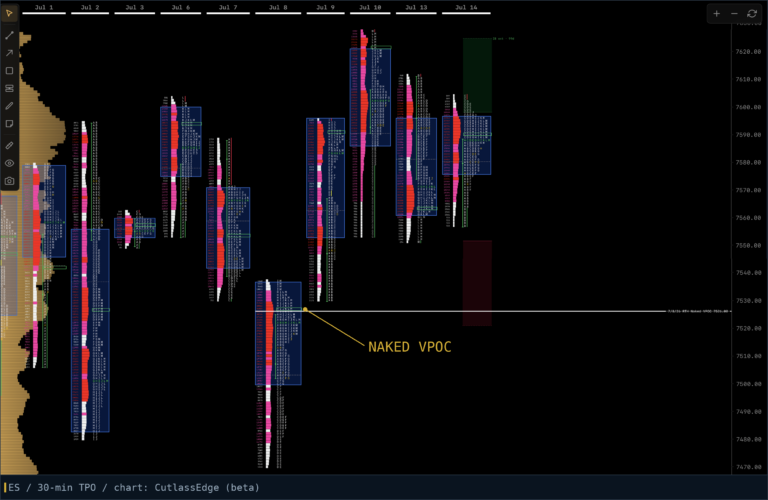
Before the open: where is the overnight sitting relative to yesterday’s value area and POC? Inside value says balance, expect rotation. Outside value says the market is auctioning for new business, expect movement, and check what unfinished business (poor extremes, singles, naked POCs) sits in the path. Anytime the market opens inside the previous day’s range I am expecting a lot of chop. That doesn’t guarantee there will be, but it significantly increases the odds of it.
At 10:30, the initial balance (IB) completes. Now I care about its width (narrow IB = breakout fuel, wide IB = probable container) and which side of it the market is testing.
The ES breaks the IB at least once a day, something like 98% of the time. So when the clock strikes 10:31 I know my first edge is asking myself which side it will break, and when it does, what comes next. If you break the high you squeeze the shorts, if you take out the low you squeeze the longs. That short covering will either bring in new business or it won’t, same with the liquidation, so that’s the next edge. Does the market get new buying above the IB or new selling below it?
Through the midday: is the developing POC holding steady or migrating? Are extensions beyond the IB finding acceptance (letters building) or getting tailed? A one-sided march of new letters with no rotation is one-timeframing, and fighting it is like donating your money to the market.
Last hour: does the day close with structure intact or does it leave a mess (poor extremes, unrepaired singles, a late spike)? Whatever it leaves unfinished, becomes tomorrow’s map.
TPO counts, briefly
Some profile traders count TPOs above versus below the developing POC to gauge which side is winning the time battle inside a rotational day. It is a legitimate old-school technique from the floor era. I personally don’t literally count, I just look to see visually if there is a node of TPOs forming anywhere, a new node of TPOs is a sign the fair price is changing.
Avoid the mistakes everyone makes at first
Don’t try to read a half-built profile like a finished one. At 10:15 the profile is three letters tall and means almost nothing yet. Shape is a developing story; let periods complete before drawing conclusions. The day might start looking like it will be a P shape, but then in the afternoon it sells off and closes the day as a bell-shaped curve.
Don’t treat the letters as signals. There is no letter pattern that means buy. The chart gives context; the trade still has to come from your plan.
Don’t ignore the overnight. The regular trading hours session profile is the cleanest read, but gaps and overnight inventory decide how the open behaves. Know both. Large nodes of time and volume from the overnight can be key support and resistance levels, especially between 9:30-11:30am ET.
Don’t focus too much on TPOs on thin markets. The profile describes an auction. A market with no depth produces a profile with no meaning. Index futures like ES and NQ are a natural fit because they are liquid every day, but even on those markets there are days where liquidity is thin, use caution on those days.
FAQ
What does TPO stand for?
Time Price Opportunity: one letter marking that a given price traded during a given 30-minute period.
Why 30-minute periods?
Convention from the CBOT floor era, and it has stuck because it works: long enough to filter noise, short enough to show the day’s structure developing. Many traders, including myself, experiment with other period lengths; learn the standard first so your charts speak the same language as the literature. Everyone I’ve talked to about it ends up coming back to 30-minute eventually, it just seems to be the sweet spot.
Are TPO charts better than candlesticks?
Different job. Candles show you path; TPOs show you acceptance. I use candlesticks for longer timeframes: daily, weekly, monthly. Anyone who tells you one replaces the other is selling something.
Can I use TPO charts on stocks or crypto?
On liquid instruments, yes, the logic carries. The literature, the norms (like what counts as excess), and most of the worked examples live in index futures, so expect to need to calibrate those specifics to your own market’s rhythms.
What software draws TPO charts?
A handful of platforms support proper TPOs, from add-ons to dedicated tools with dedicated price tags. Disclosure: we are building CutlassEdge, our own TPO and volume profile platform, and I think it is the most powerful and fairly priced one there is, but weigh my opinion on this accordingly.
Charles Gough is a full-time ES futures trader and the founder of Pirate Traders. The charts in this post were produced in the CutlassEdge development build.
Market Profile is a registered trademark of CME Group. It’s used here descriptively, to discuss the methodology.